In this guide, we will show you the steps to create a scatter plot using Google Sheets. This online spreadsheet tool from Google allows you to carry out a plethora of tasks. The collaborative editing features, tools such as Macros and Pivot Table, and the Data Validation techniques are just some of the well-known features. Along the same lines, it also has the option to graphically represent your data through bar graphs, histograms, pie charts, scatter plots, and the likes.
As far as this guide is concerned, today we will be focusing on scatter plots. For the unawares, this plot is used to establish a correlation between two variables. In other words, you could get a concrete idea about how much one variable is affected or influenced by the other one. So in order to get the overall relation or trends between two variables, this should be your go-to choice. And in this guide, we will help you with just. Today we will show you how to create a scatter plot using Google Sheets. Follow along for the detailed instructions.
Also Read
How to Create a Scatter Plot using Google Sheets
There could be quite a few instances where you might need to make use of this plot. For example, in establishing a correlation between employees’ salary and their work experience, the demand for ice-creams with the rise and fall in temperature among others.
While you could also use graphs to showcase the trends between the variables, however, they aren’t able to paint the complete picture and rather tends to over complicate the matter. So with that said, let’s now check out the steps to create a scatter plot using Google Sheets.
Creating Scatter Plots
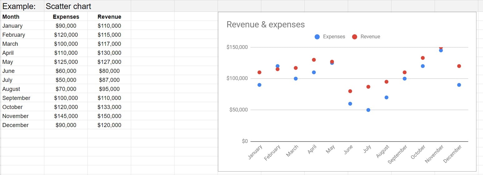
- First and foremost, you will need data formatted for this plot. So start off by creating two or more columns of data in Google Sheets. The first column will act as data for the X-axis whereas all the other columns will represent the data on the Y-axis.
- For the sake of simplicity, let’s take two columns of data which will act as the X and single Y-axis. Likewise, label both these columns as they would be acting as the titles for the axis.
- Now select all the data (including the header) and go to Insert > Chart.
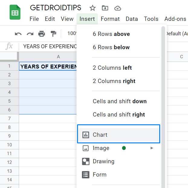
- This will open the Chart Editor.
- Go to the Setup section and select Scatter Chart from the Chart Type drop-down menu.
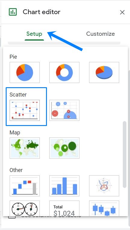
- This will create a scatter chart for the selected data, as shown in the above image.
Creating Multiple Data Scatter Plots in Google Sheets

As of now, we were dealing with a single Y-axis variable. But as mentioned before, you could also add multiple Y-axis variables by creating more column data. In the below example, we have created Month as the first column, so it will act as the X-axis. After this, the other two columns of Expense and Revenue will act as the Y-axis. The scatter chart of this data in Google Sheets will look similar to the one that we have shared above.
Creating a Bubble Scatter Chart
Along the same lines, if you have multiple Y-axis variables, you could use a Bubble Scatter Plot. As above, the first 2 dimensions are the horizontal (X) and vertical (Y) axes. The third dimension will act as the size of the bubble. The steps to create a Bubble Scatter chart is quite similar to the normal scatter chart in Google Sheets. You just need to have the data properly formatted, as mentioned below:
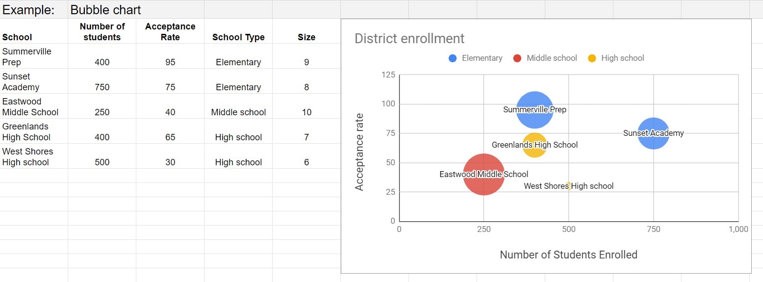
- First Column: Type in a label that will show up inside the bubble.
- Second Column: In this column, enter the values for X-axis.
- Third Column: Here, enter the Y-axis values. Each column of Y-values will show as a series of points on the chart.
- Fourth Column: Enter the name of the data series, where each data series is a different color.
- Fifth Column: Finally, enter a number for the size of the bubble.
- Rows: Do keep in mind that here each row represents a bubble on the chart.
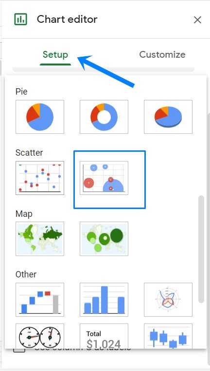
Select all the data (including the header) and go to Insert > Chart. Now under the Chart Type section, scroll to the Scatter section and select Bubble Chart. The corresponding chart of the selected data will now be created, as shown in the above image.
Customizing Scatter Plots
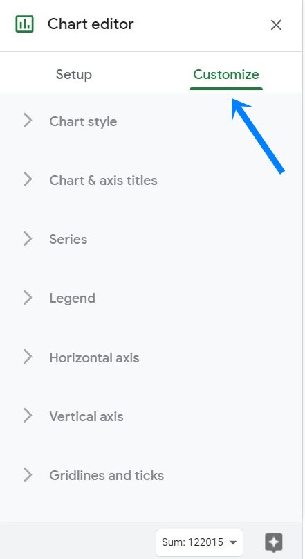
You could also customize the scatter plots that you have just created via Google Sheets. To do so, bring up the Chart Editor via Insert > Charts. Then go to the Customize section and you may now make changes to the Chart Styles, edit its axis titles, change point colors and axis location, or even could even change the legend position. Likewise, you could also edit or format X and Y-axis texts or add and edit gridlines. You could also customize the look of the Bubbles (in the case of Bubble Scatter Plot).
So with this, we conclude the guide on how to create a scatter plot using Google Sheets. We have also shared the instructions to create multiple data plots and the Bubble Scatter plots and the steps to customize them. If you have any queries concerning the aforementioned steps, do let us know in the comments section below. Rounding off, here are some iPhone Tips and Tricks, PC tips and tricks, and Android Tips and Tricks that you should check out as well.