In this tutorial, we will show you how to make a Pie Chart in Excel. This spreadsheet software from Microsoft has made it quite easy to create, manage, and edit a large set of data. Along the same lines, you could also make use of its handy features such as Pivot table, Macro, and Graphical Tools. Talking about the last one, it beholds quite a few options. For example, you could create Histograms, Pie Charts, Bar graphs, Statistical Charts, Scattered Charts, among others. In this guide, our focus will be on Pie Charts.
But why would one need a diagrammatical representation of data when everything is laid down in numerical formats? Well, a single pie chart can display a plethora of information at once and in an easy to understand visual format. This straightaway translates to the immediate analysis of all your data. Then the fact that you could use many different variations of this chart further adds to the ease of data representation. So if you also echo these thoughts and wish to make a pie chart in Excel, then the below instructions shall help you out.
Also Read

How to Make a Pie Chart in Excel
There are a few things to keep in mind before you head over to create a Pie Chart. First off, make sure that you only have one data series. Furthermore, none of the values should be 0 or a negative number. Likewise, you shouldn’t use too many data categories, or it might lead to a cluttered pie chart which would make it difficult to understand. Anything around 6-7 data categories are generally the preferred ones. So with all that in mind, let’s get on with the steps to make a pie chart in Excel.
- Input the required data in your Excel spreadsheet.
- Then select all the data and head over to the Insert tab.
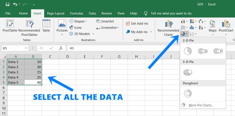
- Click on the Pie Chart icon under the Charts section.
- Select from the 2D Pie, 3D Pie, or the Doughnut shaped charts. As an example, we would be using the 2D Pie.
- As soon as you have made the selection, its associated chart will be created. Select it and you should then see three different options:
- The first option is the Chart Elements. This further beholds three important options:
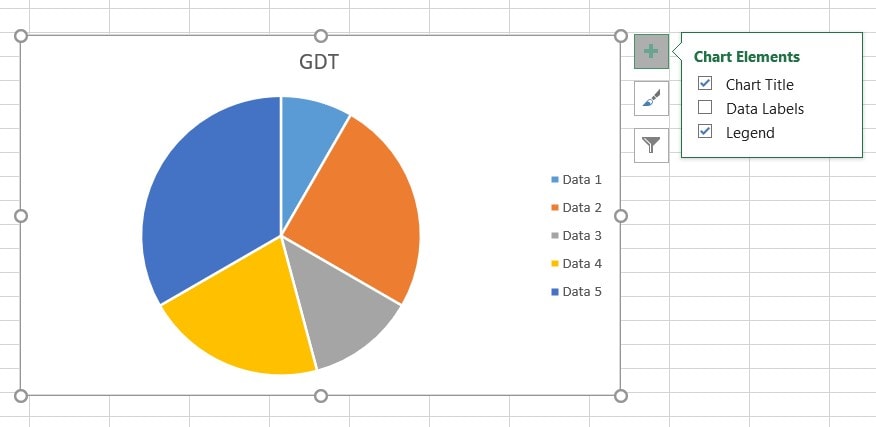
- Chart Title: whether you wish to display the name of the Pie Chart or not.
- Data labels: Enabling this option will show the percentage share of each pie, right inside their respective pie itself
- Legend: Using it you could show or hide what each of the pie represents (in our case Data 1, Data 2, etc).
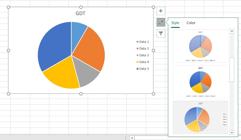
- The second option is the Chart Styles. As the name suggests, it allows you to make and customize the Pie Chart in Excel by selecting from various styles, designs, colors, etc.
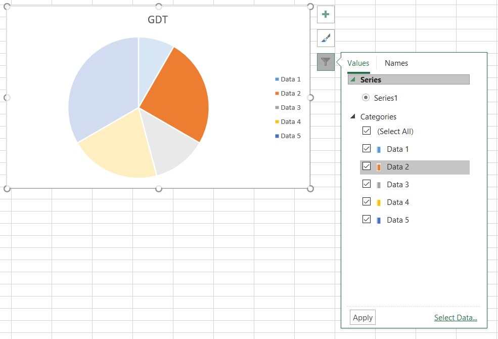
- The third and final option is Chart Filters. Using this feature, you could filter your Pie Chart and remove certain element/elements from it. Just untick the categories by Values or Name, and hit Apply situated at the bottom. That value will then be hidden from your Pie Chart.
- For further modification, head over to the Design tab from the top menu bar and select the desired customization options.
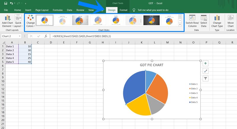
That’s it. These were the steps to make a Pie Chart in Excel. If you have queries concerning the aforementioned steps, do let us know in the comments. On that note, here are some iPhone Tips and Tricks, PC tips and tricks, and Android Tips and Tricks that you would find equally useful.